Colour psychology and mobile app colour trends started back in 2008 when the first app store opened allowing us to create our own apps and bring ideas to life, however the colour wheel itself was designed by isaac newton in 1666
Did you know that the colour of the year for 2021 according to leading industry experts Pantone is Ultimate Gray and Illuminating which is a happy shade of yellow 🙂
Colors communicate meaning, and can be a great representation of our feelings and emotions.
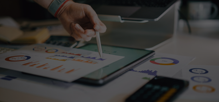
So, in a world where we are online or fixated on our smartphones the majority of the time it is key to get the colour scheme of our app icon right. Lets take a look at mobile app colour trends! 🙂
Colour Psychology and App Design
Colours stimulate emotions, which is why they are so important in branding and app design!
The colour you choose for your app is crucial because it is the first thing your user will see. Colour psychology in app design focuses on how the colours of your branding affect your users and how they connect to your brand.
User engagement is highly important in the world of app development and ensuring your app is a success, so if you user connects with your branding and colours you have already taken a step in the right direction.
Colour can cause an emotional response so choosing the right colour to evoke the right emotion can mean the difference between a user downloading your app or passing it by and is one of the most important decisions to make when launching a new product.
Colour psychology – Let’s talk about Blue!
You may already know this, but Blue is the most widely used colour for app icons for both Android and IOS, making up 23% of the percentage of all top apps
The high court of color, Pantone Color Institute also declared that its Color of the Year for 2020 was Classic Blue.
So why is blue so popular?
When we want to build trust and convey calmness and reliability we turn to Blue. Some of the most widely used apps Facebook, Linkedin, Skype and Twitter, Paypal are all blue!
These apps also collect the most personal data from us – interesting hey?
Colour psychology – a brief rundown
Red of course means passion, fire and anger and most of all – hunger! It’s no surprise that most food and drink apps are red! – Open Table, McDonalds, Vivino, Pizza Hut, KFC & Hungry Jacks
Green is soothing, natural and evokes balance. A lot of large multinationals who are big on sustainability and corporate and social repsonsibility have green logos but unfortunately green hasn’t proven to be a massive colour trend in app development but interestingly a lot of the communication apps are green – Facetime, Whatsapp, Trip advisor, Duolingo
Yellow is cheerful, fresh and energising – Snapchat and Bumble the dating app are both yellow
Orange means happiness, attractiveness and wealth. 5% off apps are Orange including Etsy, and Audible, whereby the user is spending money. Orange is also very popular for fitness apps too!
Pink can convey love, emotion and sensitivity – Instagram and Airbnb Both have pink in their icons – Airbnb rebranded with the aim of bringing the community together and instagram is an online community!
Purple is often associated with royalty and luxury, Purple both calms and stimulates our bodies, so it’s no surprise that a lot of lifestyle apps are purple – Itunes & Podcasts are both purple.
Black evokes strength, power and elegance – a lot of retail brands use black such as Adidas, Tik Tok also uses Black,
Final Thoughts
Colour choice is key when you want to make your app stand out from the crowd, spend some time and do some research and ask yourself – Does your colour scheme fit your demographic and target audience? Does my colour scheme and messaging match up? What feedback am I getting from my users? Keep it simple, don’t mix too many colours!
Media Shark specilaise in brand identity for app development – reach out to us if you need help with your colour choice and branding! 🙂